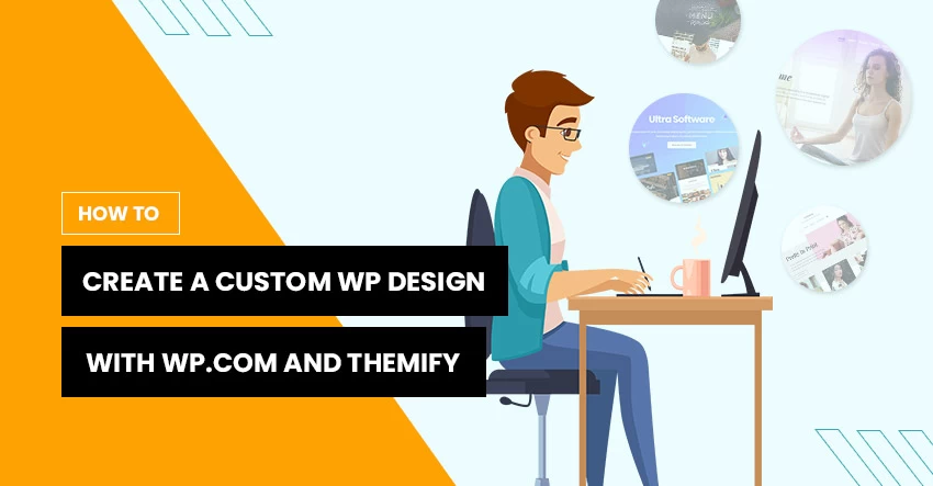
Are you looking to create a stunning custom WordPress design? If so you’re in the right place. We’re revealing how to achieve exactly that with WordPress.com and Themify Ultra!
Whether it’s the first time you’re creating a website or you frequently work on custom WordPress design for clients, beautiful aesthetics are a must-have.
If you’re brand new to the web building game, you're likely wondering: which website builder will best suit my needs? But even veteran web designers are continually looking for new ways to simplify customization, site responsiveness, SEO - the list goes on...
There are loads of website builders out there that provide everything you need to build a fully functioning website. But as well as basic web design features, there are other significant factors to consider. (more…)
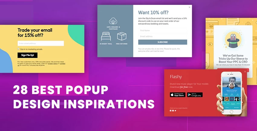
Popups are increasingly becoming one of the most common tools that most website owners are using. Whether you need survey responses, signups, or sales, popups allow you to take control of your audience online. Popups are types of interfaces that would suddenly appear in the foreground, usually in a small boxed window, to display information as the visitor lands or scrolls on a site. This window displays information related to the website and its objective would be to capture the visitor's attention and take control of their next step.
Today, there are many different type of popups, making it challenging and equally important to select the right design for the right purpose. The free Themify Popup plugin provides you with an easy and intuitive way to create all kinds of popups that would cater to your needs. You can display popups based on certain conditions such as time-based, on-site load, scroll-triggered, or exit-intent - all of which can be used to fulfill a certain action on any given site. In this post, we'll look at some of the best recommended designs for WordPress users.
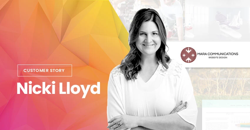
We’re excited to announce another Customer Story of a stay-at-home mom turned professional website designer who has a truly large collection of beautifully designed sites. Read on for her tried and true plugin recommendations and become inspired hearing her upward solo journey of website designing.
About Me
I am Nicki Lloyd, and I run Mara Communications, a website design and consultancy business based in Melbourne, Australia. I am also co-director of Hub Business Solutions, which provides an online marketing and communications portal for local businesses.
Mara Communications was founded in December of 2014 as a web design company. My professional background was in print management for several large companies. After a largely corporate career, as a full-time mum, I made the decision to not return to it. Without a technology or design background, I dabbled in newsletter and website editing for a local community playgroup. This was my first taste of website design.
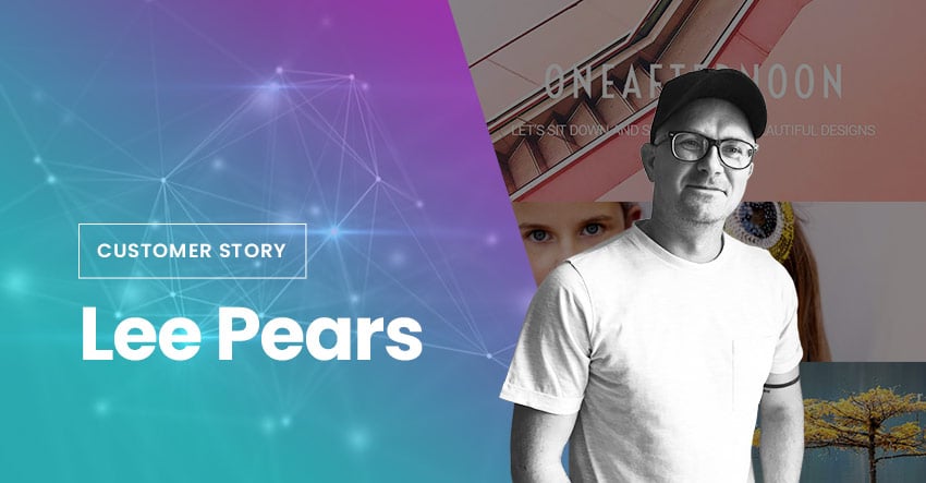
Welcome back to a new installment of our Customer Stories. Just like his name Lee Pears, his story is also short and sweet. He shares how he went from a veteran graphics designer for major fashion magazines, including British GQ, Tatler, and Elle UK, into an empowered web designer.
Making the switch from old media to new media can be hard, but Lee shares it isn’t so. Let’s hear from him now.
About Me
My name is Lee Pears. Yep, you guessed it, pears like the fruit. ‘Pears like the fruit’ is actually my Instagram handle because of the amount of times I’ve had to say it so that people would get the spelling right – I at least thought it was about time it paid its dues.
Responsive styling or responsive web design is an approach that makes websites render well on a variety of devices and screen sizes. It is becoming an increasingly important feature for all websites as mobile traffic now accounts for more than half of total internet traffic. (more…)
It is official now, Google's latest formula favors websites that are defined as "mobile-friendly". If you don't want to lose your rank in mobile search, be sure your site design is mobile-friendly. If it is not, don't need to panic. We have a quick & affordable solution for you — simply switch to any Themify's responsive theme. We've been building responsive themes for many years. All our responsive themes pass the Google's Mobile-Friendly Test.
Bizco - This theme was released in 2010, one of our first generation responsive themes, and it passed!
Notes:
If you see a message "There was a problem with the request. Please try again later.", click on the "Analyze" button to get the report (the tool might be busy).
We have only listed a few of examples above. You may use the Mobile-Friendly Test to test all our responsive theme demos.